Microsoft Reinvents 1985
posted Saturday Feb 18, 2012 by Scott Ertz

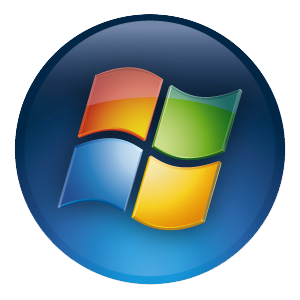
Microsoft has made a bold move this week, announcing the end of an era; the most inappropriate branding in the tech industry. For the past 20 years, Microsoft has used a flag to denote its Windows line of products, but it didn't used to be that way and won't be that way much longer.
Paula Scher, from the Pentagram design agency, asked the Windows team a very simple, but important question:
Your name is Windows. Why are you a flag?
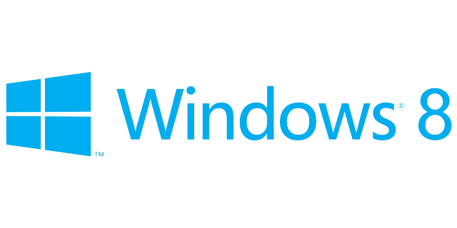
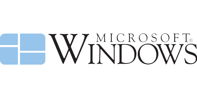
Indeed. So, how do you solve that problem? You return to Windows origins, as so much of the consideration for Windows 8 and the Metro UI in general has done, and re-imagine the original logo with a modern flare. The new logo features live tiles, the foundation for the Metro interface, arranged to form a window. When compared against the existing Windows logo, it seems a huge departure, but when compared against the original Windows logo, everything over the last 20 years seems to be the departure from the sane.
Hit the break to see the new logos side-by-side, along with the current Windows logo.
What do you think of the new design? Let us know below!


